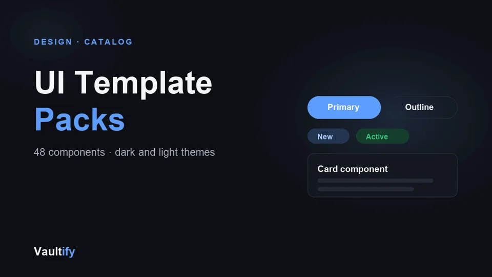
DESIGN · CATALOG

UI Template Packs

48 copy-paste components in one dependency-free CSS file — buttons, forms, tables, navigation, overlays and feedback. Dark and light themes, themeable with CSS variables, ready to drop into any project.

UI Template Packs: what's inside

What's included

48 components across six groups. Actions: buttons in five variants and three sizes, icon buttons, button groups, segmented controls. Forms: inputs, textareas, selects, checkboxes, radios, switches, input groups, search fields, fieldsets, with invalid and disabled states. Data display: cards, tables, badges, chips, avatars, stat tiles, list groups, description lists, code blocks, keyboard keys, blockquotes. Feedback: alerts, toasts, banners, progress bars, spinners, skeleton loaders, empty states, tooltips. Navigation: navbar, sidebar, tabs, breadcrumbs, pagination, dropdown menus, steppers, toolbars. Overlays: modals, popovers, accordions. Every class is namespaced vf-, and a full light theme ships alongside the dark one.

How it works

Every component is namespaced with a vf- prefix so it won't collide with your existing styles. Colors, spacing, and corner radius are controlled by CSS variables at the top of the file — change them once to retheme every component in the pack.

License

Commercial use permitted for unlimited personal and client projects. Redistribution or resale of the pack itself isn't permitted. Includes free lifetime updates.

Is it right for you?

Great if you're

  • Developers who want a consistent interface without adopting a framework
  • Founders building an MVP, admin panel or internal tool fast
  • Designers who hand off to code and want classes that match their mockups

Not the right fit if

  • You need React or Vue components with built-in behaviour: this is CSS only
  • You want a Figma file: the pack is code, with a live HTML preview

What you'll be able to do

What's in the download

css/components.cssThe library: 48 components in about 880 lines, no dependencies
COMPONENTS.mdEvery component, class name and variant, in one index
preview.htmlAll 48 components rendered live, with a dark/light toggle
README.mdSetup in three steps, theming and browser support
CHANGELOG.mdVersion history

What you need

Any website or web app where you can add a stylesheet. Plain HTML, React, Vue, Svelte or a CMS theme all work, because it's ordinary CSS. No build step.

Questions buyers ask

Does it work with React, Vue or Tailwind?

Yes. It's plain CSS with every class prefixed vf-, so you use the class names in any framework and it won't clash with Tailwind or your own styles.

Can I change the colours to match my brand?

Yes. Theme colours, radii and the spacing scale are CSS variables at the top of the file. Change --vf-accent and everything accent-coloured follows, in both themes.

Is JavaScript included?

No, it's a CSS library. Components that open and close, like modals and dropdowns, are styled for every state; you add the toggle with your own code or framework.

How do I see everything before using it?

Open preview.html in a browser. There's also a free preview of 7 components on this site.

Ready to ship faster?

Download the pack and start building in minutes.

Buy Now — $29